
Studio Sota
healthcare
who is? what to?
Studio Sota is Dr. Majlinda Sota’s medical office. Located in Lugano, the clinic provides general medical services as well as specialized offerings such as laboratory testing, physiotherapy, dietetics, and additional healthcare services, including home medical visits. Prior to this project, they had no online presence and no publicly available information, making it impossible to locate or contact the practice when needed. The primary objective of the project was therefore to establish a strong online presence for the client across search engines, social media platforms, and mapping services.
logo & logotype
The logo rappresents a hummingbird (in italian “Colibrì”). The hummingbird symbolizes joy, resilience, love, and healing across various cultures and spiritual traditions. Its tiny yet tireless form evokes vitality, freedom, and divine messages. It represents joy, lightness, and adaptability to life, urging one to savor positive experiences. It brings comfort from deceased loved ones or celestial guides. It also signifies rebirth, perseverance, and overcoming obstacles through relentless energy.

logo

logotype
typography
Fraunces for titles and Bricolage Grotesque for body text. The two fonts are used in combination to create a clear hierarchy and a modern, elegant look. The use of sans-serif fonts also reflects the brand’s focus on simplicity and clarity, while the choice of colors and typography helps to convey a sense of sophistication and refinement.
Fraunces

Bricolage Grotesque
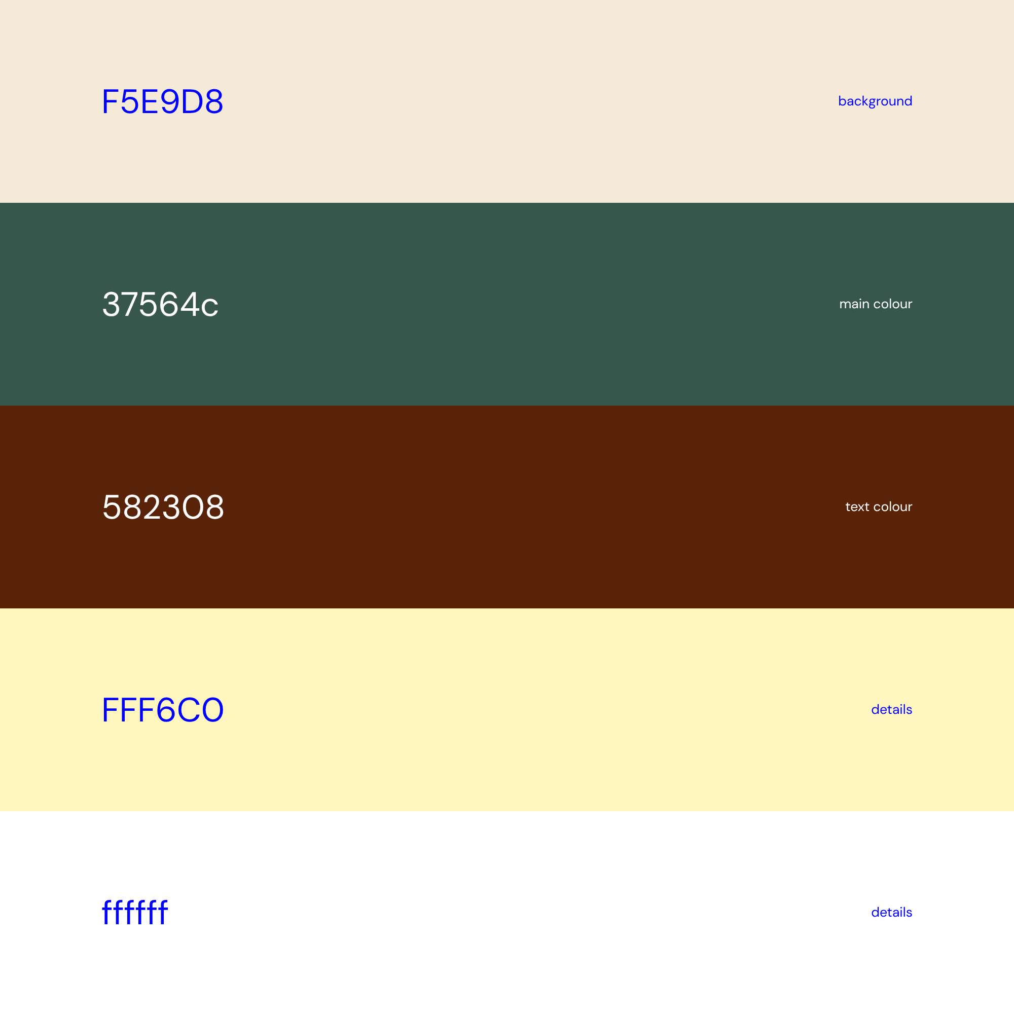
color palette
scroll for more