
Lake Como Tourism
tourism
who is this?
Lake Como Tourism was born from a deep lovefor Lake Como and a genuine passion for hospitality. With strong local knowledge and a careful eye for detail, they create authentic and refined experiences designed to let guests discover the lake at its very best. From private boat tours to tailor-made itineraries, they aim to offer more than just a service: they create memorable moments shaped around each guest’s preferences. Their goal is to provide a seamless, elegant, and personal experience, combining the beauty of the destination with warm, attentive hospitality
(our) goal
Createa digital identity. And helping them to get ready to sail. website, social media, and some help on the maganing side like for example finding a good managing system that had OTA integrations, migrating from google to microsoft 365, finding a good provider for financial and banking services and much much more.
logo & logotype

logo
logotype
coloured
white
black
abcd blablabla
Petrona for titles and Montserrat for body text. The two fonts are used in combination to create a clear hierarchy and a modern, elegant look. The use of sans-serif fonts also reflects the brand’s focus on simplicity and clarity, while the choice of colors and typography helps to convey a sense of sophistication and refinement.

Petrona
Montserrat
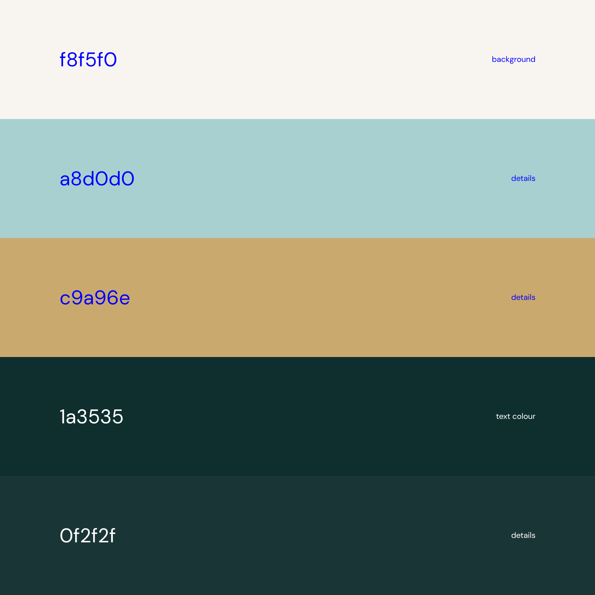
rgb,cymk,hex,colors.
scroll for more